15 Dec Everyone Scrolls
There is no fold. Period. There, I said it.
Let’s stop the fold madness right now. The Web has evolved and so have users. We now have research to prove it.
Designers often come across the concept of “above-the-fold” placement, whereas content is placed at the top of a Website before the user must scroll down. In the nineties, scrolling was a real concern with designers and developers, so much so that content was purposely placed at the very top of a Webpage. Luckily, things have changed a lot, users have evolved and become more comfortable with scrolling (it’s completely natural and in fact more efficient than clicking through multiple pages or screens), and we now have research that shows that scrolling and above-the-fold placement is not an issue anymore.
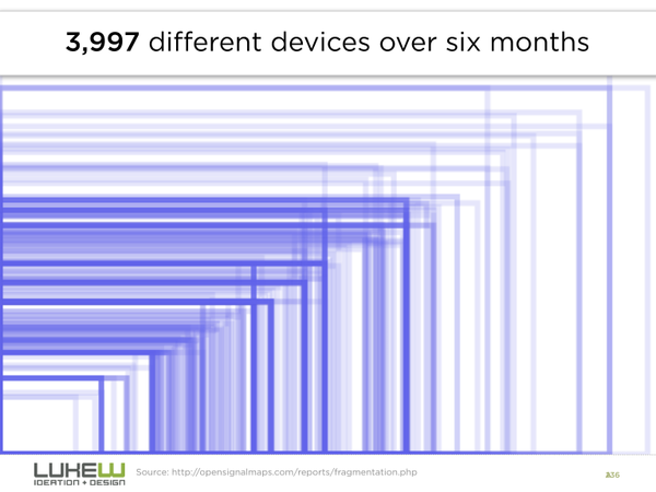
Also consider this — with so many devices and screen sizes to support, finding the right height for the fold is nearly impossible. Thankfully, we don’t have to anymore. One of the concerns way back when was that users would not scroll (or simply not know to scroll) and would therefore never see the content below the fold. However, research indicates this is not a real concern any longer. During a project we worked on with Oracle (in 2011), we discovered that the mere presence of a scrollbar was enough to indicate that there is content below the fold. To take that a step further, In July 2011 Apple removed the scrollbar from Mac OS X (it’s the default setting, though users can put it back). This clearly shows that people are so familiar with scrolling that they don’t even need the visual clue for it anymore.

Interestingly, there have been many studies recently that have rebuffed the above-the-fold myth. Here are some interesting quotes and facts:
Almost all participants scrolled, no matter what.
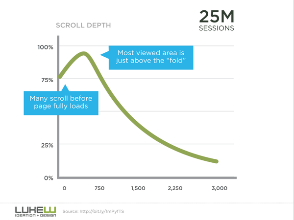
…Positions slightly below the fold between 600 and 1000 pixels typically have both high viewership and high engagement.
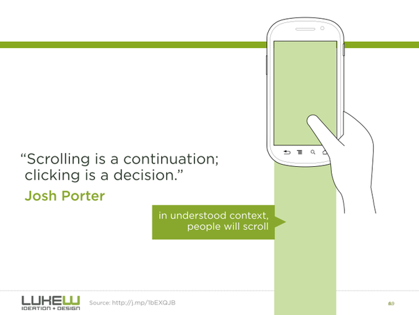
For a continuous and lengthy content, like an article or a tutorial, scrolling provides even better usability than slicing up the text to several separate screens or pages.

https://twitter.com/lukew/status/542723295804551168/photo/1
- Chartbeat, a data analytics provider, analysed data from 2 billion visits and found that “66% of attention on a normal media page is spent below the fold.” — What You Think You Know About the Web Is Wrong
- Heatmap service provider ClickTale analyzed almost 100.000 pageviews. The result: people used the scrollbar on 76% of the pages, with 22% being scrolled all the way to the bottom regardless of the length of the page. That said, it’s clear that page top is still your most valuable screen estate. — Unfolding the Fold and ClickTale Scrolling Report and Part 2
- The design agency Huge measured scrolling in a series of usability tests and found “that participants almost always scrolled, regardless of how they are cued to do so — and that’s liberating.” — Everybody Scrolls
- Usability expert Jakob Nielsen’s eye-tracking studies show that while attention is focused above the fold, people do scroll down, especially if the page is designed to encourage scrolling. — Scrolling and Attention
- Upon reviewing the analytics data of TMZ.com, Milissa Tarquini found that the most clicked link on the homepage is at the very bottom. She also points out that polls and galleries at the bottom of AOL’s Money & Finance homepage get a lot of clicks in spite of their position. — Blasting the Myth of the Fold
- Another eye-tracking study conducted by CX Partners confirms that people do scroll if certain design guidelines are followed. — The myth of the page fold: evidence from user testing
- Usability studies by the Software Usability Research Laboratory’s show that users can read long, scrolling pages faster than paginated ones. Their studies confirm that people are accustomed to scrolling. — The Impact of Paging vs. Scrolling on Reading Online Text Passages
- Jared Spool’s usability tests from 1998 tell us that, even though people say they don’t like to scroll, they are willing to do so. Moreover, longer and scrollable pages even worked better for users. — As the Page Scrolls
- SURL conducted another usability study, confirming that people find both scrolling and paging natural on search results pages. — Paging vs. Scrolling: Looking for the Best Way to Present Search Results
- Luke Wroblewski provides small snippets of stats and advice on scrolling behavior — There’s No Fold
In Summary
People scroll. It’s easier, faster, and more effecient to scroll than to click “more” or “page 2.” People scroll before the page is fully loaded and therefore the content directly below the fold has a higher viewership in many cases than the content above the fold. We can officially get rid of this myth of above-the-fold once and for all. There is no fold!


No Comments